A Tale of Two Hemispheres
1. Introduction |
|
|
Claims of global warming are often accompanied by graphs showing
the difference (i.e. anomaly) between global average temperatures
and the long-term average during 1961-90 inclusive. These global averages might imply that warming is uniform around the world but this is far from the truth. A comparison of the temperature anomalies in the northern and southern hemispheres shows some significant differences and perhaps the differences between the two hemispheres provides some interesting clues about warming. This article has 11 sections... - sections 2-4 - Land-based temperature anomalies - section 5 - Land-based anomalies for winter and summer - sections 6-8 - Temperature anomalies for land and sea (and combined) in both hemispheres - section 9 - Land and sea temperature anomalies for the northern hemisphere - section 10 - Some differences between the hemispheres - section 11 - Observations and conclusions >>SPECIAL NOTE: The hemispheric temperature anomalies are corrected for the geometry which sees lines of longitude being closer as one moves further away from the equator. (Data from the UK's Climate Research Unit.) |
|
2. Land-based monthly temperature anomalies (Jan 1995 to Dec 2004) |
|
Below is a graph based on data from the Climate Research Unit at the University of
East Anglia, in the UK. (The year is noted beneath the data point for January.)
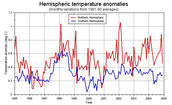 Three points stand out - the anomalies in the northern hemisphere are usually much higher than the anomalies for the southern hemisphere - the temperature anomaly in the northern hemisphere is generally increasing but the anomaly for the southern hemisphere changes little - the greatest anomalies for the northern hemisphere often occur during the northern winter. |
|
3. Land-based averaged anomalies (Jan 1995-Dec 2004) |
|
This graph is the five-month average of the above anomalies and it produces a smoother
graph in which to observe the above points.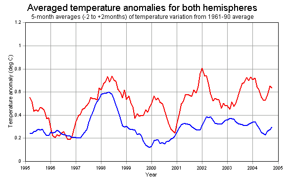 |
|
4. Land-based averaged anomalies over 25 years (Jan 1980-Dec 2004) |
|
This graph is the five-month average of the monthly anomalies between January 1980 and December 2004.
It shows the variation that has occurred compared to the recent trend of the anomaly for the
northern hemisphere being greater.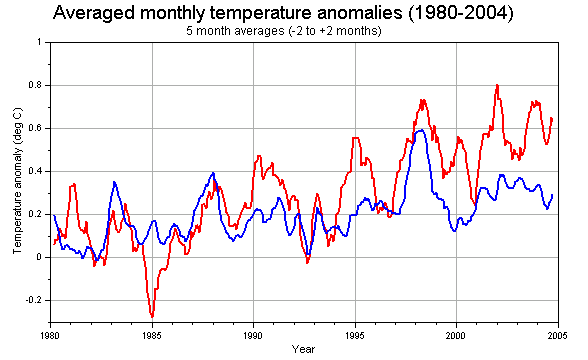 The temperature anomaly in the northern hemisphere has increased more rapidly than that for the southern hemisphere since 1985. Typically the January anomaly is an annual peak for the northern hemisphere although at times December or February are higher. |
|
5. Land-based annual Winter and Summer anomalies (1945-2004) |
|
This graph is the annual anomalies for the two hemispheres with June, July and August in one
season and December (previous year), January and February in the other. Below it is a graph of the
winter and summer anomalies averaged over 5 years (from -2 to +2 from the current year).
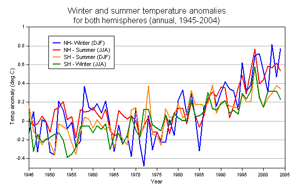 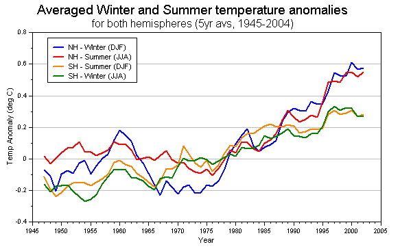 Note the period of warmer NH winters from 1957 to 1964 - slightly above zero anomaly when before and after were below zero - and then the rapid decline into colder winters until about 1975. Also notice the different starting times for the increasing trend that might already have peaked in the SH. In the NH the winter temperature anomaly started increasing about 1974 but the summer temperature anomaly a year or two later. By contrast SH temperature anomalies started increasing about 1955 according to this graph but perhaps even earlier. |
|
6. Combined land and sea monthly temperature anomalies (Jan 1995 - Mar 2005) |
|
The image below shows temperature anomalies for the two hemispheres
over the last 10 years.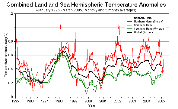 The differences between the two hemispheres are obvious and these are despite the relatively uniform levels of carbon dioxide in both hemispheres. Note also that the global average temperature has been on a downward trend since the start of 2002! |
|
7. Averaged combined land and sea monthly temperature anomalies (Jan 1980 - Dec 2004) |
|
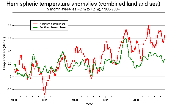 Temperature anomalies as running 5 month averages (i.e. current month -2 to current month + 2) for period of 25 years. The difference between northern and southern hemispheres is clear. Note that in 1998 both hemispheres had temperatures well above the long term average for an extended period and this meant that global temperatures were higher than normal. |
|
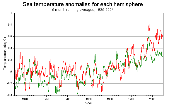
8. Sea temperature anomalies in both hemispheres (Jan 1935 - Dec 2004) |
|
 |
|
9. Land and sea temperature anomalies in the Northern Hemisphere |
|
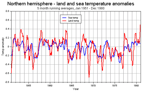 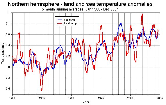 ...but between Jan 1980 and December 2004 the picture is quite different. Land temperature anomalies often exceed sea temperature anomalies, both data sets are showing an increase since about 1985 and now the northern winter is the time of the peaks in temperature anomaly. That latter point is interesting but it may just be a consequence of lower average winter temperatures during 1961-90 making the more recent temperatures higher compared to that average. |
|
10. Some differences between the Hemispheres |
|
|
There are many differences between the northern and southern hemispheres that might have an
influence on weather and climate. PHYSICAL (a) greater land area (and less sea area) in the NH (and probably more forests, agriculture, lakes etc.) (b) ocean currents circle the earth at high latitudes in the SH but not in the NH (c) the polar regions of the SH are colder than the polar regions in the NH (d) the NH has land areas which are further from the oceans along the same line of latitude - i.e. east-west distance to the sea is greater. HUMAN (e) NH has a greater population and this means more large cities (which may be distorting the observed temperatures) (f) the use of energy (for heating, transport, power etc.) is greater in the NH and that means more "man-made" heat is released to the atmosphere (g) winter peak values for the anomaly may be a reflection of improved heating methods releasing more heat (h) carbon dioxide emissions in the NH are greater (although as we saw above, the increases in the NH and SH were similar in 1995-2004) (i) greater atmospheric pollution occurs in the NH (j) Countries which are rapidly becoming industrialised - and increasing atmospheric emissions - such as China and India are located in the NH. |
|
| 11. Observations and Conclusions | |
|
(a) Severe El Nino
conditions occurred in the Pacific during 1998-99. It was recently claimed by
NASA's James Hansen (as if it was the first time it had been thought of) that the 1998
El Nino had an influence on global temperatures. (Hansen also claimed that weak El Nino
conditions in 2002 and 2003 had an influence on temperatures in those
years !) (d) Carbon dioxide levels continued to increase across the 10 years of the above graphs. Carbon dioxide levels measured at Mauna Loa (Hawaii) increased by 16.3 ppmv, at the South Pole by 16 ppmv and at Alert (northern Canada) by 16.7ppmv in the period from December 1994 to December 2003. Despite the relative consistency in the increase of carbon dioxide, temperature variations have been irregular in the two hemispheres. (c) Carbon dioxide levels are cyclic in both locations due largely to photosynthesis and seasonal temperature with the northern hemisphere cycle showing maximum levels in March or April and minimum levels in September or October. This does not correspond to changes in the above temperature anomalies. (d) Patterns of temperature anomalies are quite different. In the southern hemisphere these have been relatively stable for the last 3 to 4 years but much larger variations have occurred in the northern hemisphere where the pattern of monthly values is less regular. There is some correlation in 1983, 88, 93 and 98 and for a longer period in the 1960s but generally the lack of good correlation between the temperature anomalies in the two hemispheres suggests that the principal driver probably operates on a multi-decadal (or longer) timescale. Sustained increases in carbon dioxide appear to have no consistent impact. |
|