Melbourne as an Urban Heat Island
Introduction |
||||||||||||||||||||||||||||||||||||||||||||||||||||||||||||||||||||||||||||||||||||||||||||||||||||||||||||||||||||||||||||||||||||||||||||||||||||||||||||||||||
|
The term "Urban Heat Island" (UHI) is used to indicate a
urban locality - city, town or settlement - where temperatures
appear to have risen as the urban environment has changed.
The effect is believed to be a consequence of an increase in population but
an increase in urban area, an increase in building height
or other changes to the natural environment in the surrounding
regions may also have an influence. From 1950 to 1990, Melbourne, the capital city in the Australian state of Victoria, had a population increase from 1.5 million to about 2.5 million. Within the city (where the weather observations are taken), buildings progressively became higher and these blocked wind, cast shadows and, via the thermal properties of newer building materials, changed the daily patterns of heat flow. Other factors such as increased motor traffic and the increase in use of air conditioning in buildings probably also caused additional heat energy. The evidence that Melbourne is a UHI comes from a comparison of the mean temperatures in Melbourne with mean temperatures in other localities within the state. NASA's Goddard Institute for Space Studies (GISS) provides temperature data for observations stations around the world and from this repository data for certain Victorian stations was extracted. Only data for stations with continuous annual mean temperature data from prior to 1945 until 1992 was used and this criteria was met by just nine observation stations including Melbourne. These stations are shown in the map below. |
||||||||||||||||||||||||||||||||||||||||||||||||||||||||||||||||||||||||||||||||||||||||||||||||||||||||||||||||||||||||||||||||||||||||||||||||||||||||||||||||||
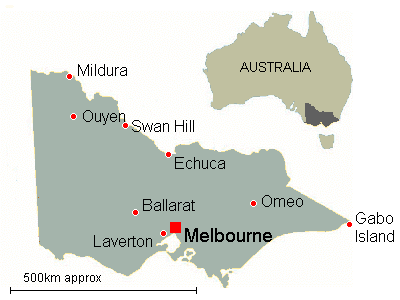
Locations of observation stations used in this analysis. |
||||||||||||||||||||||||||||||||||||||||||||||||||||||||||||||||||||||||||||||||||||||||||||||||||||||||||||||||||||||||||||||||||||||||||||||||||||||||||||||||||
Comparison of Mean Temperature anomalies |
||||||||||||||||||||||||||||||||||||||||||||||||||||||||||||||||||||||||||||||||||||||||||||||||||||||||||||||||||||||||||||||||||||||||||||||||||||||||||||||||||
|
The average annual mean temperature from 1961-1990
was calculated for each station and subtracting the annual mean values produced
the annual mean temperature anomaly. (This is in accordance with
standard practice.) The annual anomalies were averaged
across a period of 5 years (-2 to +2 years) in order to smooth
the data and expose trends. The graphs of these average anomalies are shown below. 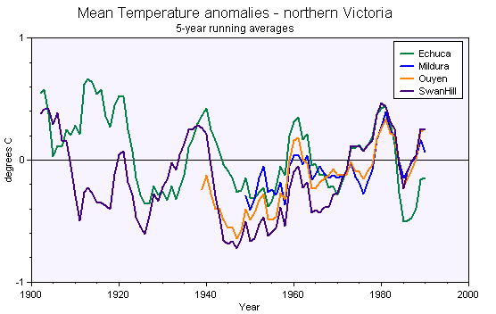 Averaged mean temperature anomalies for northern Victorian locations. Of special note here is that averaged mean temperatures at Swan Hill show a change from +0.3 to -0.7 in less than ten years. This 1 degree difference in less than 10 years exceeds the difference 0.95 degrees in similar 5-year averages for the Australia-wide mean temperature across the 49 years between 1941 and 1989. Annual mean temperatures usually fluctuate from one year to the next but in this case of Swan Hill, the annual mean temperatures was just above 16.5 in 1940-42 (following 3 years above 16.8) but for the following four years it failed to exceed 15.7. 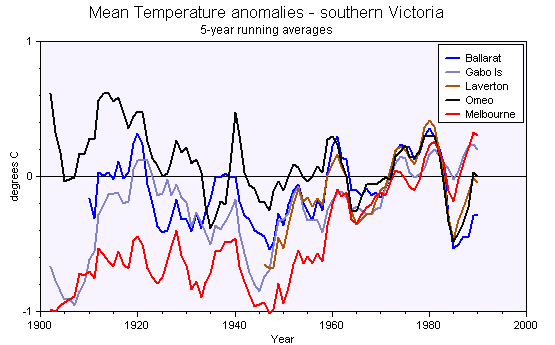 Averaged mean temperature anomalies for central and southern Victorian locations. Variations of up to one degree in less than 20 years can be seen but also changes over a longer period of time. Mean temperatures at Omeo and Ballarat have varied within narrower bands than at Gabo Island and Melbourne although the latter two locations are coastal and oceans are generally considered to have a moderating effect on temperature. |
||||||||||||||||||||||||||||||||||||||||||||||||||||||||||||||||||||||||||||||||||||||||||||||||||||||||||||||||||||||||||||||||||||||||||||||||||||||||||||||||||
Melbourne as an Urban Heat Island |
||||||||||||||||||||||||||||||||||||||||||||||||||||||||||||||||||||||||||||||||||||||||||||||||||||||||||||||||||||||||||||||||||||||||||||||||||||||||||||||||||
|
The average anomalies for all country locations except Ouyen were calculated, which required the
trimming of data to the maximum period with data from all locations. (Ouyen was rejected
in order to avoid the bias of three locations in relative proximity.) The average anomaly
and the temperature anomalies for Melbourne were re-based with the respective 1950 values
both set to 0. The results are shown in the graph below. 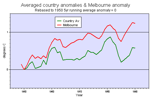 Melbourne anomaly compared to the average anomaly for country locations. Data for Laverton is included in the averaged anomalies and despite its proximity to Melbourne, the exclusion of Laverton data generally make a difference of just a few hundredths of a degree. |
||||||||||||||||||||||||||||||||||||||||||||||||||||||||||||||||||||||||||||||||||||||||||||||||||||||||||||||||||||||||||||||||||||||||||||||||||||||||||||||||||
What difference does the UHI make? |
||||||||||||||||||||||||||||||||||||||||||||||||||||||||||||||||||||||||||||||||||||||||||||||||||||||||||||||||||||||||||||||||||||||||||||||||||||||||||||||||||
The graph of the difference between the anomaly for Melbourne and the average anomaly for the other
locations shows the difference that the development of Melbourne had on temperature.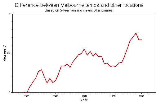 The influence of the urban heat island effect. The decline in difference between the anomalies during 1970-80 partly coincides with the decline in Australia-wide annual men temperatures about 1975-77 but it might also be related to an increasing use of brick construction in country towns. | ||||||||||||||||||||||||||||||||||||||||||||||||||||||||||||||||||||||||||||||||||||||||||||||||||||||||||||||||||||||||||||||||||||||||||||||||||||||||||||||||||
And compared to nearby locations ...? |
||||||||||||||||||||||||||||||||||||||||||||||||||||||||||||||||||||||||||||||||||||||||||||||||||||||||||||||||||||||||||||||||||||||||||||||||||||||||||||||||||
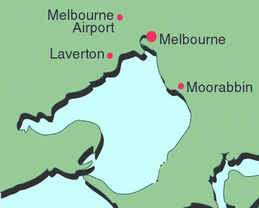
| The annual mean temperature in Melbourne can be compared to
three other locations within 25 kilometres. (see map below). |
||||||||||||||||||||||||||||||||||||||||||||||||||||||||||||||||||||||||||||||||||||||||||||||||||||||||||||||||||||||||||||||||||||||||||||||||||||||||||||||||||
|
||||||||||||||||||||||||||||||||||||||||||||||||||||||||||||||||||||||||||||||||||||||||||||||||||||||||||||||||||||||||||||||||||||||||||||||||||||||||||||||||||
| The geography of the situation is as follows:
There are no intervening mountains, hills or forested areas. Only Moorabbin
is surrounded by the urban area. Weather comes from the west and
winds are typically from the south, west or north and the other
compass directions in this semicircle. For the period in
question Laverton and Melbourne Airport were largely exposed to
the north, west and south. The annual mean temperatures for these sites in the period 1971-1990 can be seen below. |
||||||||||||||||||||||||||||||||||||||||||||||||||||||||||||||||||||||||||||||||||||||||||||||||||||||||||||||||||||||||||||||||||||||||||||||||||||||||||||||||||
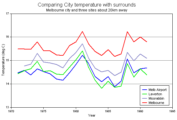
The annual mean temperature in Melbourne is consistently higher than these other locations that are just 21km away. In particular it is generally about 1 degree higher than at Laverton and at Melbourne Airport. For comparison, the global temperature at the end of 2004 was reportedly 0.4 degrees higher than the 1961-1990 average. |
||||||||||||||||||||||||||||||||||||||||||||||||||||||||||||||||||||||||||||||||||||||||||||||||||||||||||||||||||||||||||||||||||||||||||||||||||||||||||||||||||
|
Another way to examine this is via the average monthly minimum and maximum temperatures across
the period 1981-2008. The graphs below show that Melbourne City has a higher
average minimum temperature than the surrounding stations in every
month. The difference between the city and the listed station
with the lowest minimum ranges from 1.9C (May & Jun) to 2.4C
(Sep & Oct) and averages 2.08C. The city also has a higher maximum temperature during 11 months - the exception is February when Scoresby has 26.7C and the city has 26.6C. The minimum difference to the other stations is 0.7C (Jan & Mar) and the maximum difference is 1.2C (July). The average maximum for July in the city is 0.4C warmer than the next warmest of the listed stations, Laverton. (Scoresby station, data for which appears in these graphs, can be found on the map lower down this page.) 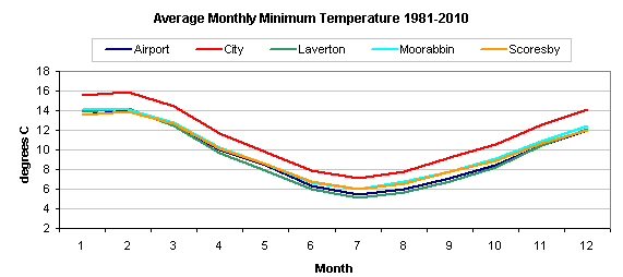 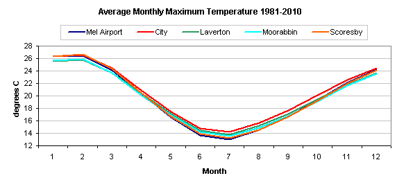 |
||||||||||||||||||||||||||||||||||||||||||||||||||||||||||||||||||||||||||||||||||||||||||||||||||||||||||||||||||||||||||||||||||||||||||||||||||||||||||||||||||
An example day |
||||||||||||||||||||||||||||||||||||||||||||||||||||||||||||||||||||||||||||||||||||||||||||||||||||||||||||||||||||||||||||||||||||||||||||||||||||||||||||||||||
|
Here's a powerful example of the difference between the observation station in the city of Melbourne
and those in the suburbs. The city observation station is well protected from south-westerly winds
but this protection prevents temperatures falling as low as they might with these winds from
the Southern Ocean. Compare the details for the city (in bold) with the details from the other observation stations. (A map below shows the relative positions of all stations.) Weather Details for the Melbourne Region at 13:07 AEST, Thursday 4 August 2005
In the Extremes section of the table, the maximum temperature is measured between 9am and midnight, the minimum temperature is measured from 9am the previous day until 9am on the current day. The maximum wind gust is reset at 9am. 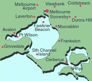 Coldstream is the only location outside the metropolitan area and is sheltered by hills to the west and the south. (Data from Australia's Bureau of Meteorology.) |
||||||||||||||||||||||||||||||||||||||||||||||||||||||||||||||||||||||||||||||||||||||||||||||||||||||||||||||||||||||||||||||||||||||||||||||||||||||||||||||||||
And globally ? |
||||||||||||||||||||||||||||||||||||||||||||||||||||||||||||||||||||||||||||||||||||||||||||||||||||||||||||||||||||||||||||||||||||||||||||||||||||||||||||||||||
|
If this is the effect from just one urban area that increased its population from 1.5 to about
2.5 million people in about 40 years, then what has been the UHI effect in other locations
around the world ? Even more importantly, have the higher temperatures caused by these effects led to distortion of the annual average temperatures? Many scientists claim that there is no effect because observation stations in large urban areas are a small minority of the total but other scientists point to a discernible heat island effect in towns with a population as small as 1,000 people and since most observation stations require local residents to make the recordings, the UHI effect might be very real. Other scientists have shown that temperature recordings at stations outside urban areas may still be affected by the Urban Heat Island effect in nearby cities and towns. For these reasons it appears to be very difficult to make allowances for any UHI effects when analysing temperatures and therefore difficult to dismiss the possibility that UHI effects are creating a false impression of global warming. |
||||||||||||||||||||||||||||||||||||||||||||||||||||||||||||||||||||||||||||||||||||||||||||||||||||||||||||||||||||||||||||||||||||||||||||||||||||||||||||||||||
Further reading |
||||||||||||||||||||||||||||||||||||||||||||||||||||||||||||||||||||||||||||||||||||||||||||||||||||||||||||||||||||||||||||||||||||||||||||||||||||||||||||||||||
|
Heat
Island Effect - from the United States Environmental Protection Agency (EPA) The Urban Heat Island Effect in Winter at Barrow, Alaska by Hinkel, Nelson, Klene and Bell, International Journal of Climatology, 23, pp1899-1905 (PDF document) Urban Heat Islands and Climate Change - Melbourne, Australia by Jon Morris, University of Melbourne Urban Heat Islands in Small Towns - Deniliquin, Australia also by Jon Morris, University of Melbourne Urban Heat Contamination Spreads from The Greening Earth Society |
||||||||||||||||||||||||||||||||||||||||||||||||||||||||||||||||||||||||||||||||||||||||||||||||||||||||||||||||||||||||||||||||||||||||||||||||||||||||||||||||||